Table of Contents
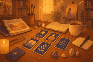
Your home is more than just a physical space. It’s a reflection of who you are, what you value, and how you want to feel when you walk through the door at the end of a long day. I’ve always believed that the most beautiful rooms are the ones that tell a story, and recently I’ve been exploring an unexpected source of inspiration for interior design: tarot archetypes.
Now, before you imagine crystal balls in every corner or dramatic occult imagery on the walls, let me clarify. I’m talking about something much more subtle and, I think, more meaningful. Each card in the tarot deck represents a different energy, mood, or aspect of human experience. When you think about it, these archetypes can serve as incredibly rich mood boards for creating spaces that feel intentional and deeply personal.
Why Tarot Archetypes Work as Design Inspiration
The beauty of using tarot imagery as a springboard for decorating lies in its symbolic depth. Unlike a typical Pinterest board that might show you what’s trendy right now, tarot archetypes tap into something more timeless. The Empress doesn’t go out of style. The energy of The Hermit remains relevant whether you’re decorating in 2025 or 2045.
When I first started thinking about this approach, I was redesigning my reading nook. I kept looking at paint swatches and fabric samples, but nothing felt quite right. Everything seemed either too generic or too trendy, and I wanted something that would feel meaningful over time. That’s when I pulled The High Priestess card during a reflective journaling session, and something clicked. The card’s imagery of deep intuition, quiet knowledge, and mystical contemplation was exactly the energy I wanted my reading space to embody.
What makes this method particularly interesting is that it encourages you to think beyond surface aesthetics. You’re not just asking “What color should I paint this room?” but rather “What feeling do I want to cultivate here?” Perhaps that distinction seems small, but in practice, it changes everything.
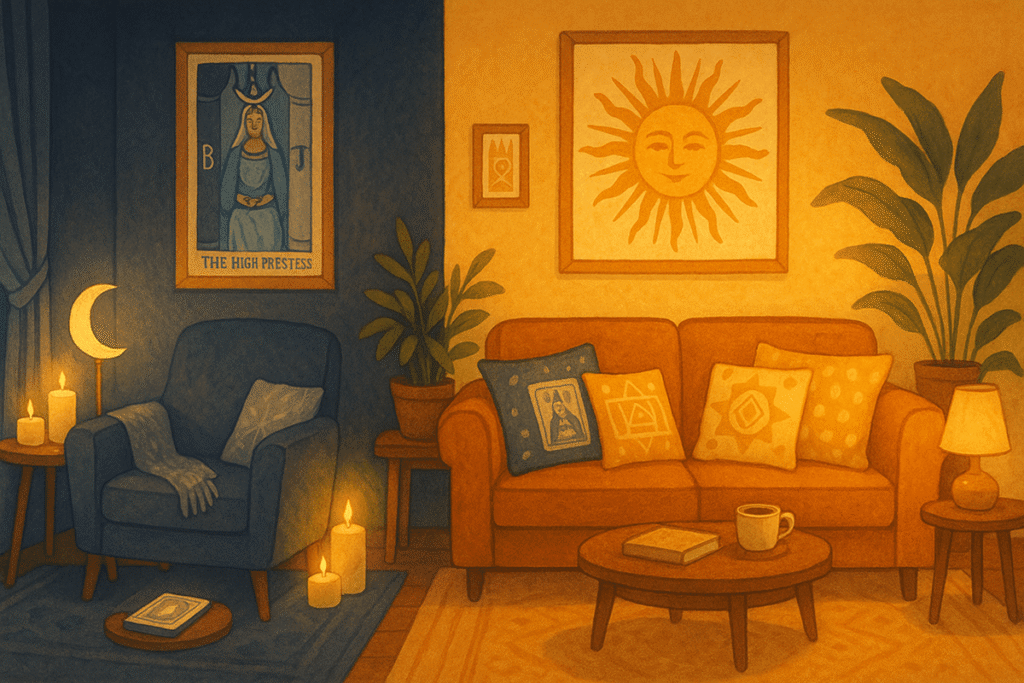
The High Priestess and Creating Sacred Quiet Spaces
Let’s start with The High Priestess, since that’s the card that first inspired me to explore this whole concept. This archetype represents intuition, inner wisdom, and the quiet spaces between thoughts. Visually, the card often features deep blues, silvery whites, and crescent moons. There’s a sense of mystery and introspection that feels almost tangible.
When you use The High Priestess as your design guide, you’re creating a space that invites stillness. Think about a reading nook, a meditation corner, or even a bedroom where you want to prioritize rest and reflection. The color palette practically suggests itself: midnight blues, soft grays, touches of silver or pewter. I painted one wall in my reading corner a color the paint company called “Twilight Harbor,” and I added sheer curtains in a pale silver that catch the afternoon light beautifully.
Lighting becomes crucial in a High Priestess space. You want it soft, never harsh. I use a combination of a small table lamp with a fabric shade and some battery operated candles on a floating shelf. The goal is to create an environment where your mind naturally quiets down. Perhaps you add some velvet cushions in deep purple or indigo. Maybe a small collection of books with interesting spines, arranged more for their visual texture than perfect organization.
The furniture should feel substantial but not overwhelming. I’ve noticed that lower seating works particularly well here. A floor cushion or a chair that sits close to the ground creates that sense of being grounded and introspective. One thing I didn’t expect was how much the absence of bright colors would affect the space. There’s something about limiting your palette that actually makes the room feel more expansive, like you’ve carved out a little sanctuary.
The Sun and Designing Joyful Living Spaces
On the complete opposite end of the spectrum, you have The Sun card. Where The High Priestess whispers, The Sun practically shouts with joy. This archetype is all about vitality, optimism, celebration, and pure, uncomplicated happiness. The traditional imagery features a bright sun, often with a child or sunflowers, and a palette dominated by golden yellows, warm oranges, and clear sky blues.
A Sun inspired room feels like summer morning energy captured in interior design form. This works beautifully for a living room, a kitchen, or any space where you gather with others and want to encourage conversation and laughter. I helped a friend redesign her living room using this concept, and the transformation was remarkable. We started with a warm butter yellow on the walls, nothing too intense but definitely cheerful.
What I find fascinating about working with The Sun energy is how it invites you to be bold with texture and light. We added brass fixtures, which caught the natural light coming through her west facing windows. There were throw pillows in various shades of gold, marigold, and amber. She found this amazing vintage rug with a sunburst pattern that became the room’s centerpiece. The whole space felt like it was smiling, if that makes sense.
Plants become essential in a Sun themed room. Not delicate, finicky plants but robust, thriving ones. Sunflowers in a vase on the coffee table during summer. A large fiddle leaf fig in the corner. Maybe some herbs in terracotta pots on a sunny windowsill. Living things that reach toward light naturally reinforce the archetype’s message about growth and vitality.
Perhaps the most important element is ensuring plenty of natural light. If you’re working with a darker room, this might mean choosing The Sun as your inspiration is actually counterproductive. But if you have good windows, celebrate them. Keep window treatments minimal and light colored. Let that sunshine pour in and play across your golden accents throughout the day.
The Tower and Spaces for Transformation
Now, this might seem like an odd choice for home decor, but hear me out. The Tower typically represents sudden change, breakthrough moments, and the dismantling of old structures. It’s not a comfortable card, honestly. But there’s something powerful about creating a dedicated space for transformation and creative destruction.
I’m thinking about a home office or a studio space, somewhere you do challenging work or engage in creative projects that push you. The Tower’s energy suggests exposed brick or concrete, industrial elements, and a certain rawness. Maybe your color palette includes charcoal grays, deep reds like brick dust, or even stark black and white contrasts.
The key here is embracing a certain amount of visual tension. Unlike The High Priestess space which invites calm, or The Sun room which radiates joy, a Tower inspired space should feel energizing and a bit edgy. This is where you might display your work in progress, keep your tools visible, or maintain a large inspiration board that’s constantly evolving.
I’ve seen this work particularly well in creative studios where the occupant wants to break out of old patterns. The slightly uncomfortable energy of The Tower reminds you that growth often requires releasing what no longer serves you. That might sound overly philosophical for a discussion about paint colors and furniture placement, but the mindset really does influence how you use a space.
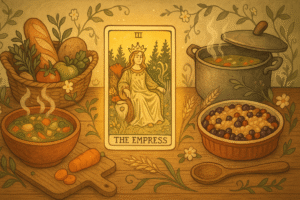
The Empress and Nurturing Spaces
The Empress archetype embodies abundance, nurturing energy, and sensory richness. If you’re designing a space meant for comfort, nourishment, or caring for others, this card offers a wealth of inspiration. Think dining rooms, nurseries, or cozy breakfast nooks.
The color palette here leans toward earth tones enriched with touches of green and rose. I imagine terracotta, sage green, warm creams, and perhaps accents in blush pink or copper. The Empress space should feel abundant without being cluttered. Perhaps you display fresh fruit in a beautiful bowl, not just for decoration but as an edible centerpiece. Soft textiles become important: linen tablecloths, woven throws, cushions that invite you to sink in and stay awhile.
What strikes me about Empress energy in design is how it encourages you to engage all your senses. It’s not enough for the space to look beautiful. How does it smell? Maybe you keep fresh herbs on the windowsill or use beeswax candles. How does it feel? Textures should be varied and tactile. I think the Empress would approve of that impulse to run your hand along a velvet chair back or knead fresh bread dough on a worn wooden countertop.
The Hermit and Personal Retreat Spaces
The Hermit represents solitude, introspection, and the quest for inner truth. Unlike The High Priestess which deals with intuitive knowledge, The Hermit is about the active seeking of wisdom through contemplation. This archetype works wonderfully for a home office, a meditation room, or any space dedicated to solitary pursuits.
The visual language here tends toward simplicity bordering on austerity. Muted colors, minimal decoration, and careful curation. Perhaps you choose a palette of soft grays, warm taupes, and natural wood tones. The lighting should be focused and directional, like a lantern illuminating a path, which is exactly how The Hermit is traditionally depicted.
What I appreciate about designing with The Hermit in mind is how it forces you to question what you truly need in a space. Every item should serve a clear purpose or bring you genuine joy. There’s no room for decorative clutter here. Maybe you have one meaningful piece of art, a comfortable chair positioned for contemplation, and a small table for journaling or study. The restraint itself becomes part of the room’s message.
Bringing It All Together
The real magic of using tarot archetypes as design inspiration lies in how it helps you create spaces with genuine intention. Instead of just copying someone else’s aesthetic, you’re engaging with symbolic meanings that resonate with how you want to live in your home. Perhaps one room channels The Sun’s joyful energy while your bedroom embodies The High Priestess’s quiet wisdom. Your home becomes a landscape of different energies, each supporting different aspects of your daily life.
I should mention that you don’t need to create a literal representation of the cards. No one needs to walk into your living room and immediately think “Ah yes, The Sun card.” The archetype is a starting point, a conceptual framework that helps you make cohesive design decisions. It’s about capturing an essence, not creating a themed space.
As you explore this approach, I encourage you to sit with different cards and notice what feelings arise. Which archetypes resonate with the energy you want to cultivate? How might those symbolic meanings translate into color, texture, light, and form? The answers will be different for everyone, and that’s exactly the point. Your home should tell your story, and tarot archetypes offer a rich vocabulary for that storytelling.
Frequently Asked Questions
Do I need to display actual tarot cards to use this decorating approach?
Not at all. The concept here is about using tarot archetypes as inspiration for your color palette, mood, and design choices, not about literally hanging cards on your walls. You’re extracting the symbolic energy and visual themes from cards like The High Priestess or The Sun and translating those into paint colors, textures, lighting, and furniture selections that capture the same feeling.
Can I use multiple tarot archetypes in one room, or should I stick to just one?
While focusing on one archetype creates the strongest, most cohesive energy in a space, you might find that blending complementary cards works for your needs. For instance, you could combine The Empress’s nurturing abundance with elements of The Sun’s joyful energy in a kitchen where you gather with family. Just be mindful that too many competing energies can make a space feel scattered rather than intentional.
How do I choose which tarot card matches a specific room in my home?
Start by thinking about how you want to feel and what activities happen in that space. What energy would support the room’s purpose? A bedroom might call for The High Priestess’s quiet introspection, while a creative studio could benefit from The Magician’s focused manifestation energy. Pull a few cards that resonate with the room’s function and see which imagery speaks to you most strongly.