Table of Contents
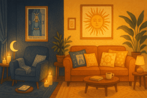
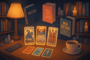
There’s something magical about opening a tarot deck for the first time. Beyond the mystical imagery and archetypal symbols, I’m always struck by the incredible artistry that goes into each card. The colors alone can transport you to different emotional landscapes, from the warm golden rays of The Sun to the deep, mysterious purples of The High Priestess. As someone who’s spent countless hours admiring various tarot decks, I’ve come to realize that these cards are treasure troves of color inspiration waiting to be discovered by artists, designers, and anyone looking to infuse their creative projects with meaningful palettes.
The relationship between color and emotion has fascinated humans for centuries, and tarot artists have long understood this connection. Each card’s color scheme isn’t arbitrary; it’s carefully chosen to evoke specific feelings and reinforce the card’s symbolic meaning. This makes tarot decks particularly rich sources of inspiration for creative endeavors, whether you’re designing a brand identity, choosing paint colors for your living room, or planning your next artistic masterpiece.
Understanding Color Psychology in Tarot Design
Before diving into specific cards and their palettes, it’s worth reflecting on how color psychology influences tarot artwork. Artists who create these decks aren’t just thinking about aesthetics; they’re considering how different hues will make you feel when you encounter each card. Perhaps this is why certain color combinations in tarot feel so harmonious and emotionally resonant.
Traditional tarot follows some general color associations that align with broader psychological principles. Warm colors like reds, oranges, and yellows often appear in cards representing passion, energy, and material success. Cool blues, greens, and purples typically grace cards associated with emotion, intuition, and spiritual matters. However, modern deck creators have expanded far beyond these conventions, offering an incredible variety of color approaches that can inspire contemporary creative work.
The beauty of using tarot as color inspiration lies in the intentionality behind each palette. These aren’t random color combinations; they’ve been thoughtfully curated to create specific moods and responses. This makes them particularly valuable for projects where you want your color choices to evoke certain feelings or convey particular messages.
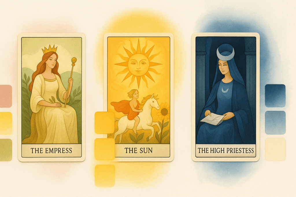
The Empress and Earth Tone Elegance
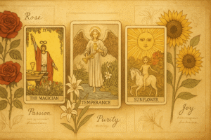
Let’s start with The Empress, one of my favorite cards for color inspiration. In most traditional decks, The Empress embodies fertility, abundance, and natural beauty through rich earth tones and verdant greens. The typical Empress palette includes deep forest greens, warm golden yellows, rich browns, and soft peaches or roses.
This color combination creates an immediate sense of groundedness and natural luxury. The greens connect us to growth and renewal, while the warm undertones suggest comfort and nurturing. I think this palette works beautifully for brands focused on wellness, sustainability, or organic products. Interior designers might find these colors perfect for creating cozy, nurturing spaces like bedrooms or reading nooks.
For artists, The Empress palette lends itself well to landscape paintings or still life compositions featuring natural elements. The combination feels both sophisticated and approachable, making it versatile for various artistic styles. Perhaps what I find most appealing about this palette is how it manages to feel both earthy and elegant simultaneously.
The Sun’s Radiant Warmth
Moving to a completely different energy, The Sun card typically bursts with vibrant yellows, bright oranges, and clear blues. This palette immediately lifts your spirits and creates associations with joy, optimism, and new beginnings. The contrast between the warm yellows and cool blues creates visual excitement while maintaining harmony.
This color scheme works wonderfully for children’s brands, educational materials, or any project meant to inspire and energize. I’ve seen interior designers use variations of The Sun palette in kitchens and playrooms, where the cheerful colors encourage activity and creativity. The brightness might feel overwhelming in large doses, but used thoughtfully, these colors can transform spaces and designs.
For artistic projects, The Sun’s palette challenges you to work with high saturation and bold contrasts. It’s particularly effective for abstract work or pieces meant to convey happiness and celebration. The key is balancing the intensity; perhaps using the bright yellow as an accent while grounding the composition with more subdued versions of the other colors.
The High Priestess and Mystical Depths
The High Priestess offers a completely different mood with her palette of deep blues, silvery whites, and mysterious purples. This combination evokes wisdom, intuition, and the unknown. There’s something about these colors together that feels both calming and intriguing, like looking at a moonlit sky reflected in still water.
This palette works beautifully for luxury brands, particularly those in beauty or wellness spaces where you want to convey sophistication and mystery. I think it’s also perfect for creating meditative spaces in homes, perhaps in a study or meditation room where you want to encourage quiet contemplation.
Artists working with The High Priestess palette often create pieces that feel dreamlike or otherworldly. The combination of cool tones creates depth and encourages viewers to look more closely, to discover hidden details within the composition. It’s a palette that rewards patience and contemplation.
The Fool’s Fresh Beginnings
The Fool card typically features bright, optimistic colors with a sense of lightness and possibility. You’ll often see pale yellows, sky blues, and fresh greens, sometimes accented with pure white. This palette feels young and hopeful, perfect for conveying new beginnings and adventure.
For branding, The Fool’s palette works well for startups, travel companies, or any business focused on helping people try new things. The lightness of these colors suggests freedom from heavy expectations or past limitations. Interior designers might use these colors in entryways or home offices, spaces where you want to encourage fresh thinking and new possibilities.
I find this palette particularly inspiring for watercolor work, where the light, airy quality of the colors can really shine. There’s something about The Fool’s color scheme that invites experimentation and play, which makes it perfect for creative projects where you want to maintain a sense of discovery.
Practical Applications for Creative Projects
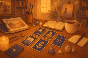
When extracting color palettes from tarot cards for your own projects, consider starting with cards that resonate with your intended message or feeling. Are you trying to create something nurturing and stable? Look to The Empress or other earth-focused cards. Need something energizing and optimistic? The Sun might be your inspiration.
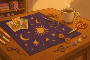
I recommend creating actual color swatches from the cards you’re drawn to. You can do this digitally using color picker tools, or even by matching paint samples to the colors you see in the cards. Sometimes the exact hues matter less than the overall relationship between the colors in the palette.
Think about proportion as well as color selection. In most tarot cards, there’s typically one dominant color with several supporting colors in smaller amounts. This same principle can guide your own color usage, helping you create balanced and harmonious designs.
Finding Your Unique Color Voice
Perhaps the most valuable aspect of using tarot for color inspiration is how it encourages you to think about the emotional impact of your color choices. Each tarot card tells a story through its imagery, and the colors are an integral part of that narrative. When you borrow these palettes for your own work, you’re tapping into centuries of symbolic and psychological associations.
The key is to remain open to unexpected combinations and to trust your intuitive responses to different color relationships. Sometimes a palette that shouldn’t work on paper creates the most compelling results in practice. Tarot cards often feature surprising color combinations that challenge conventional color theory while still feeling harmonious and meaningful.
As you explore different decks and cards, you’ll likely find yourself drawn to certain types of palettes repeatedly. This can help you develop your own color voice, whether for artistic work, design projects, or even personal style choices. The rich tradition of tarot artwork offers an endless well of inspiration for those willing to look beyond the surface and really explore the artistry within each card.
Frequently Asked Questions
Which tarot deck is best for color palette inspiration?
Honestly, there’s no single “best” deck for color inspiration because it really depends on what aesthetic you’re drawn to and what project you’re working on. Traditional Rider Waite Smith decks offer classic, accessible color combinations that work well for beginners. If you want something more vibrant and contemporary, decks like the Modern Witch Tarot or Light Seer’s Tarot feature bold, saturated colors perfect for modern branding. For minimalist projects, The Golden Thread Tarot uses a limited palette with clean lines. I’d suggest browsing different deck styles on Pinterest or Instagram to see which color schemes resonate with your creative vision before committing to one.
How do I actually extract colors from my tarot cards?
There are several free online tools that make color extraction surprisingly simple. You can photograph your tarot card (or find a high quality digital image) and upload it to tools like Coolors, Adobe Color, or Canva’s color palette generator. These tools automatically identify the dominant colors and give you the hex codes, which you can then use in any design software. If you’re working with physical cards, make sure to photograph them in natural lighting for the most accurate color capture. Some people even use their phone’s camera and color picker apps to grab colors on the go.
Can I use different tarot decks together for a single color palette?
Absolutely, and this can actually lead to some really interesting results. Perhaps you love the deep purples from one High Priestess card and the golden yellows from another deck’s Sun card. Mixing colors from different decks can help you create a more unique palette that’s truly your own rather than just copying a single card’s scheme. Just keep in mind that you’ll want to test how these colors work together, maybe by creating a mood board first. The key is ensuring the final combination feels cohesive rather than chaotic, even if the colors come from entirely different artistic traditions.
Do the color meanings in tarot matter for design projects?
They can add an extra layer of intention to your work, but they’re not mandatory. In tarot, different colors carry specific symbolic meanings that contribute to each card’s message. For example, understanding that greens in tarot often represent growth and abundance might make that Empress palette even more meaningful for an eco brand. However, if you’re simply drawn to a color combination because it’s beautiful, that’s perfectly valid too. Sometimes the emotional response to colors matters more than their traditional symbolic associations. Your intuition about what feels right for your project is often the best guide.